
TidyTuesday (01/05/2021): Transit Costs Project
Published:
About TidyTuesday
If you don’t know about it, TidyTuesday is a project put together by Thomas Mock aimed at providing the R community with an opportunity to apply their visualization and analysis skills and to discuss their work. Every week on Tuesday, a tidy dataset (one row per observation and one column per variable) is uploaded on the GitHub page of the project. R users then share their work on the dataset on Twitter using the #TidyTuesday hashtag.
TidyTuesday - January 5th, 2020: Transit Costs Project
This week, the data comes from the Transit Costs Project. Each observation is a public transit construction project. Among the interesting information it contains, are the year the construction started, the name of the project, the city in which it is developed, and the cost per km. I want to visualize all this information.
My immediate idea was to visualize the data in a way that evoke a subway map, in which each observation is a subway station and in which observations are somehow connected like subway lines are.
I first load the data and the packages I am using.
library(tidytuesdayR)
library(tidyverse)
library(ggrepel)
library(grid)
library(png)
library(scales)

tuesdata <- tt_load('2021-01-05')
transit_cost <- tuesdata$transit_cost
country_codes <- read_csv("country_codes.csv")
I merge the data with a reference dataset of country codes as I am not always sure what these 2-letter codes refer to.
transit_cost <- transit_cost %>%
  mutate(Code = if_else(country == "UK", "GB", country)) %>%
  select(-country) %>%
  left_join(country_codes, by  = "Code") %>%
  rename(country = Name,
         code = Code,
         id = e) %>%
  select(id, country, code, city, everything())
Now, here is the skeleton of what I am looking for. The country seems to be the most natural candidate to connect the observations.
transit_cost %>%
  mutate(start_year = as.numeric(str_extract(start_year, "[0-9]+"))) %>%
  filter(start_year > 1950) %>%
  ggplot(aes(x = start_year, y = cost_km_millions)) +
  geom_line(aes(group = country)) +
  geom_point()
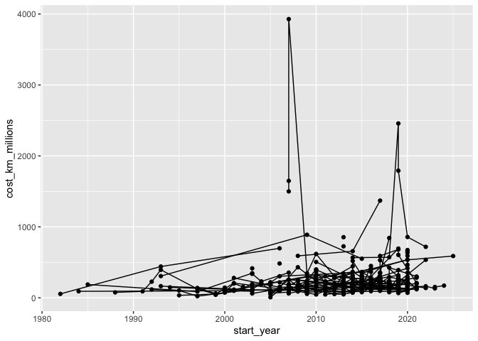
A few things stand out: first, the plot is very crowded, I need to remove some observations. Second, a log scale on the y axis would be more appropriate. I’ll use log10 for ease of interpretation. Third, connecting the dots directly doesn’t look like a subway map at all. I should use geom_step instead.
I correct these below by only including a few of the most represented countries (I exclude the PRC because it has 20 times as many observations as the second most represented country and would crowd the map).
transit_cost %>%
  mutate(country = fct_lump(country, 10),
         cost_km_millions = round(cost_km_millions, -1),
         start_year = as.numeric(str_extract(start_year, "[0-9]+"))) %>%
  filter(!country %in% c("Other", "China", "Taiwan, Province of China", "India", "Turkey"),
         rr == 0) %>%
  ggplot(aes(x = start_year, y = cost_km_millions)) +
  geom_step(aes(group = country)) +
  geom_point() +
  scale_x_continuous(breaks = c(1985, 1990, 1995, 2000, 2005, 2010, 2015, 2020)) +
  scale_y_log10(labels = unit_format(unit = "M", big.mark = ","))
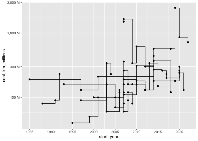
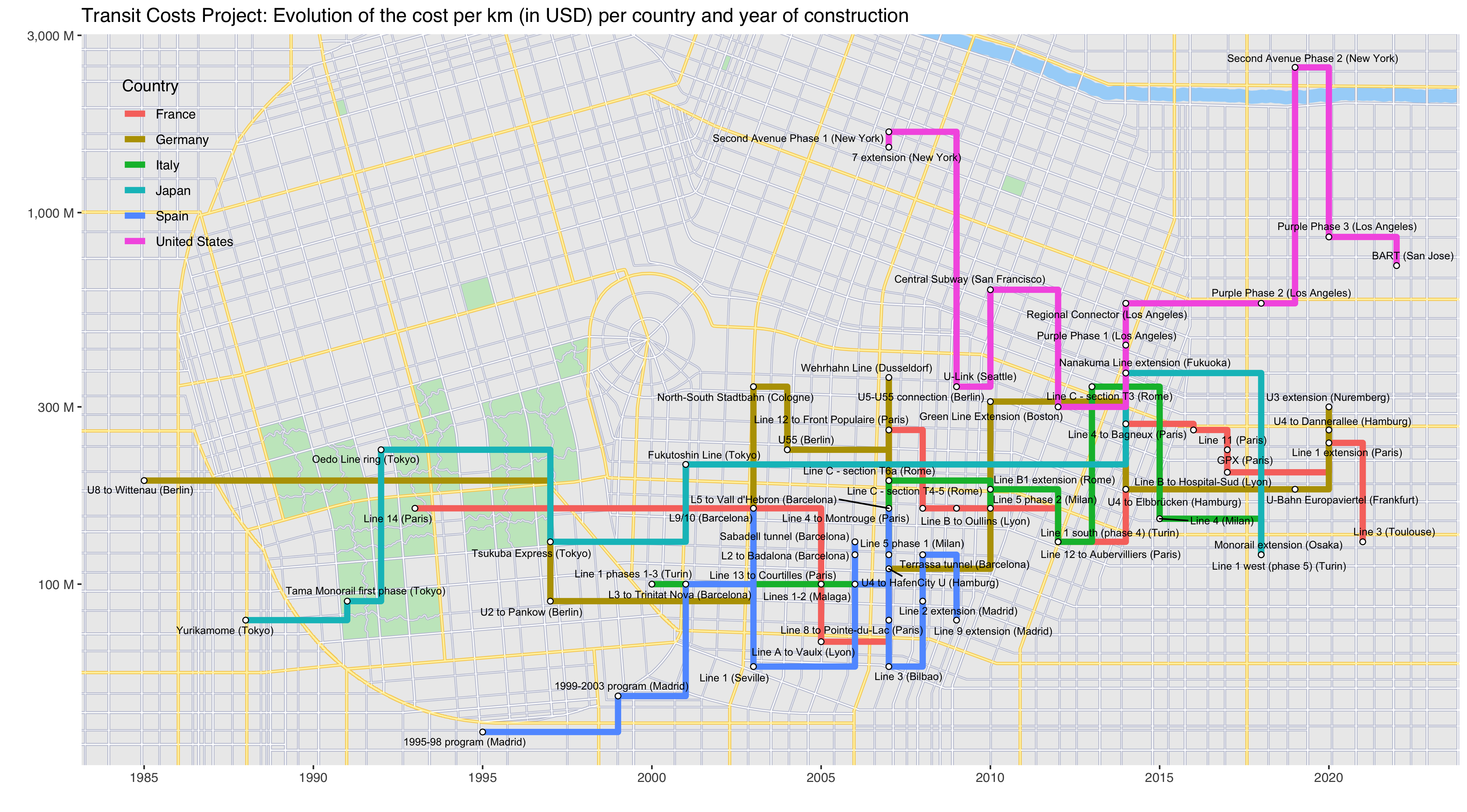
This is starting to look like something. I now customize the plot to make it look like subway lines on a map, and add the names of the “stops”.
transit_cost %>%
  mutate(country = fct_lump(country, 10),
         cost_km_millions = round(cost_km_millions, -1),
         start_year = as.numeric(str_extract(start_year, "[0-9]+"))) %>%
  filter(!country %in% c("Other", "China", "Taiwan, Province of China", "India", "Turkey"),
         rr == 0) %>%
  ggplot(aes(x = start_year, y = cost_km_millions)) +
  geom_step(aes(color = country, group = country), size = 2) +
  geom_point(shape = 21, size = 1.5, fill = "white") +
  geom_text_repel(aes(label = paste(line, " (", city, ")", sep = "")), size = 2) +
  scale_x_continuous(breaks = c(1985, 1990, 1995, 2000, 2005, 2010, 2015, 2020)) +
  scale_y_log10(labels = unit_format(unit = "M", big.mark = ",")) +
  labs(y = "", x = "", color = "Country", title = "Transit Costs Project: Evolution of the cost per km (in USD) per country and year of construction") +
  theme(
    panel.grid.minor.x = element_blank(),
    panel.background = element_blank(),
    legend.position = c(0.07, 0.82),
    legend.background = element_blank(),
    legend.key = element_blank(),
    text = element_text(family = "sans")
  )
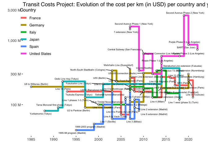
Ok, it looks bad because there isn’t enough space on the blog, but it looks good in my RStudio window (I’ll paste the final saved result at the bottom of the post).
The last touch was to add a map background. I didn’t want to use any existing city, because this “subway map” is a mix of countries, so I did a quick Google Search and found this cool procedural city generator, from which I got the map below:
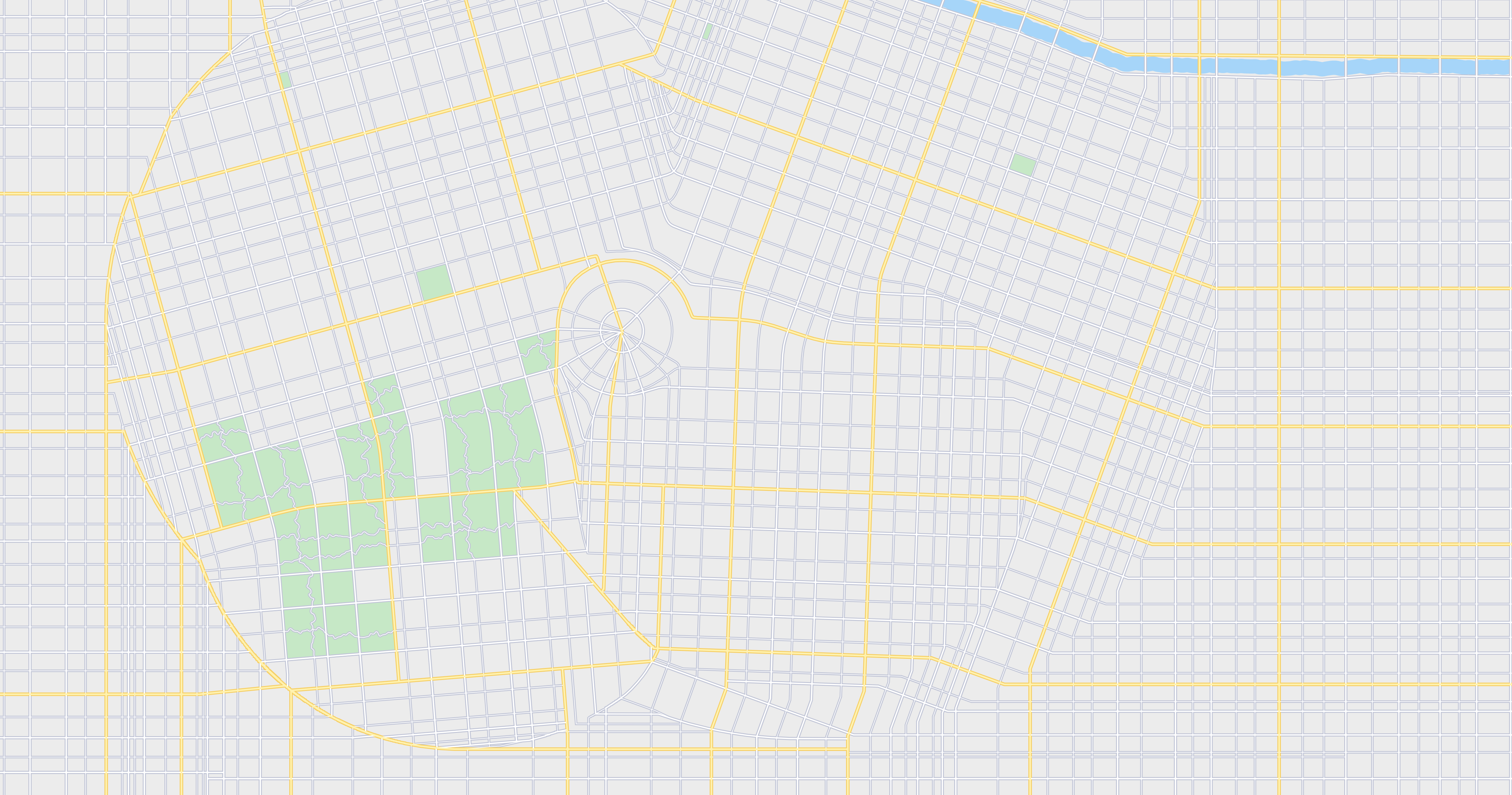
The only thing left is to add the map in the background, using annotation_custom().
generated_map <- readPNG("map.png")

transit_cost %>%
  mutate(country = fct_lump(country, 10),
         cost_km_millions = round(cost_km_millions, -1),
         start_year = as.numeric(str_extract(start_year, "[0-9]+"))) %>%
  filter(!country %in% c("Other", "China", "Taiwan, Province of China", "India", "Turkey"),
         rr == 0) %>%
  ggplot(aes(x = start_year, y = cost_km_millions)) +
  annotation_custom(rasterGrob(generated_map,
                               width = unit(1,"npc"),
                               height = unit(1,"npc")),
                    -Inf, Inf, -Inf, Inf) +
  geom_step(aes(color = country, group = country), size = 2) +
  geom_point(shape = 21, size = 1.5, fill = "white") +
  geom_text_repel(aes(label = paste(line, " (", city, ")", sep = "")), size = 2) +
  scale_x_continuous(breaks = c(1985, 1990, 1995, 2000, 2005, 2010, 2015, 2020)) +
  scale_y_log10(labels = unit_format(unit = "M", big.mark = ",")) +
  labs(y = "", x = "", color = "Country", title = "Transit Costs Project: Evolution of the cost per km (in USD) per country and year of construction") +
  theme(
    panel.grid.minor.x = element_blank(),
    panel.background = element_blank(),
    legend.position = c(0.07, 0.82),
    legend.background = element_blank(),
    legend.key = element_blank(),
    text = element_text(family = "sans")
  )
Let me know what you think or ask/suggest anything about the code in the comments. And if you’re new to R programming, have a look at my post about R resources to get started.